Battle of the Book Covers, May 2024 Edition

A bit late with this one, but better than never, eh? Here are the books I read in May that have differing US and UK covers.

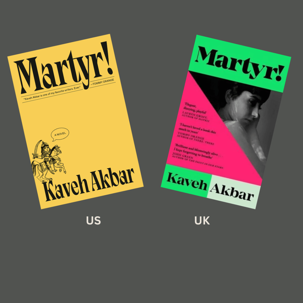
The Morningside by Tea Obreht. They just switched the color…not saturation, I’m not positive of the term I’m looking for here, maybe you can help me out. But I do enjoy the yellow and green tints on the US version more than the straight up orange and blue. A very pretty combination!

The US and Japanese editions of The Full Moon Coffee Shop by Mai Mochizuki are very similar. Preference basically comes down to if you like your astrological signs or a caffeinated beverage better on your book cover. I suppose I like the Japanese version a bit better, although the coffee drink on the US one hints at the cozy nature of the story.

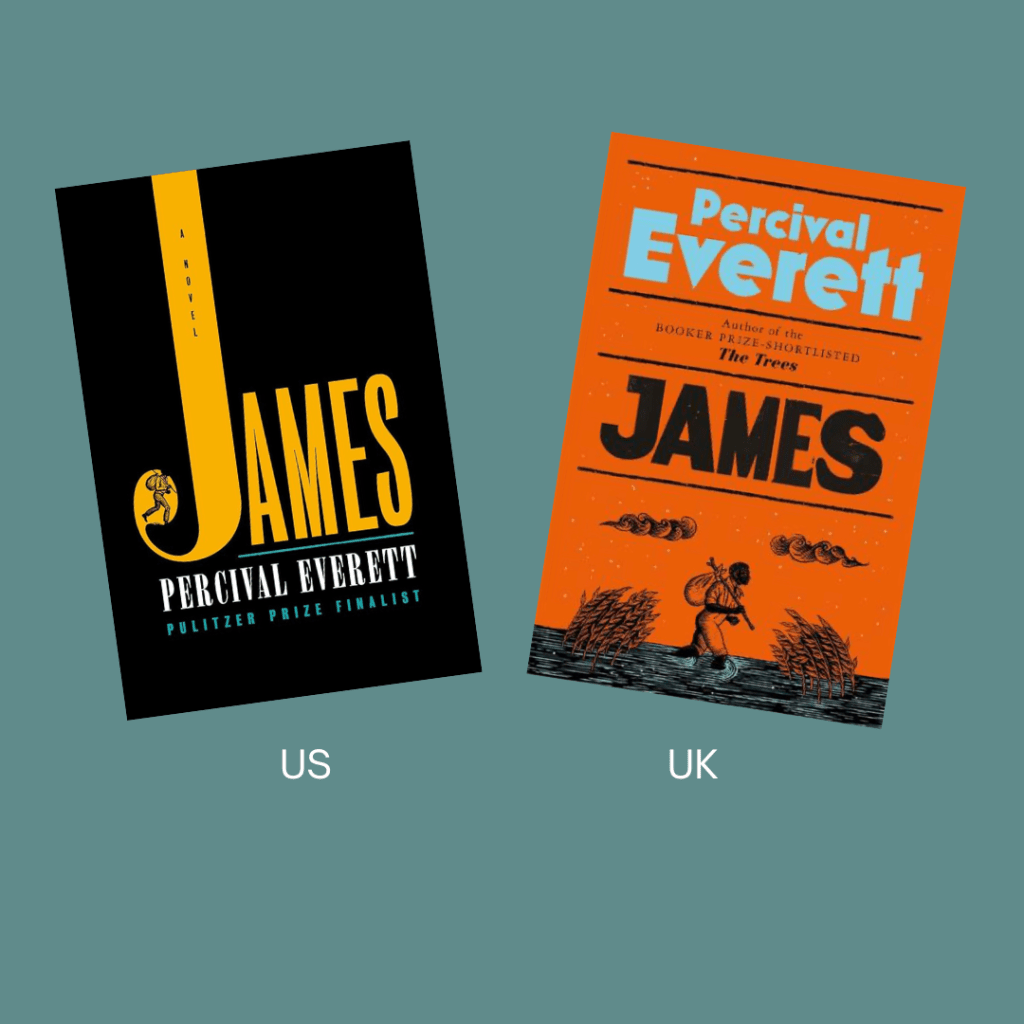
James by Perceval Everett. Both covers are decent, but I do quite like the UK version, and it gets my vote this time. The color scheme and the artwork style are both lovely!

These covers for How High We Go in the Dark by Sequoia Nagamatsu all stuck to a similar theme, but I think I like the US one best.

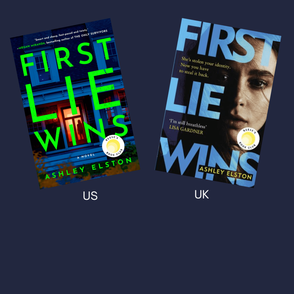
First Lie Wins by a Ashley Elston. The UK version seems a bit more appropriate to the contents of the story, but the US cover overall is more eye catching.

Book Review: THE FAMILIAR by Leigh Bardugo

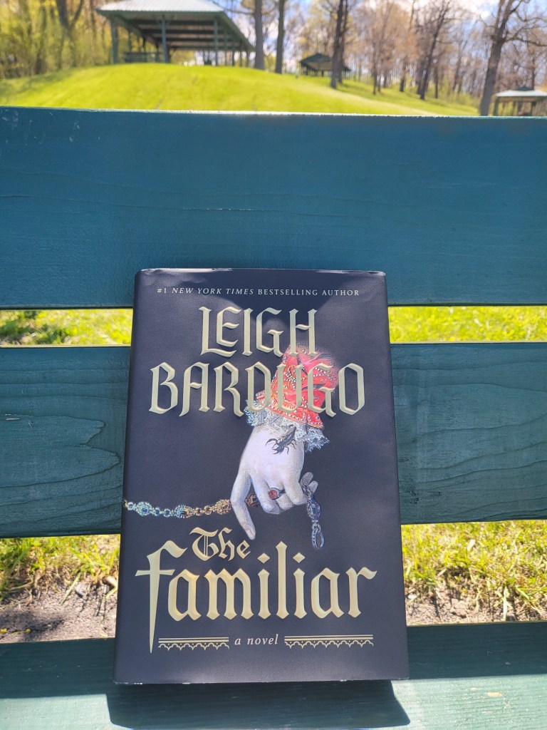
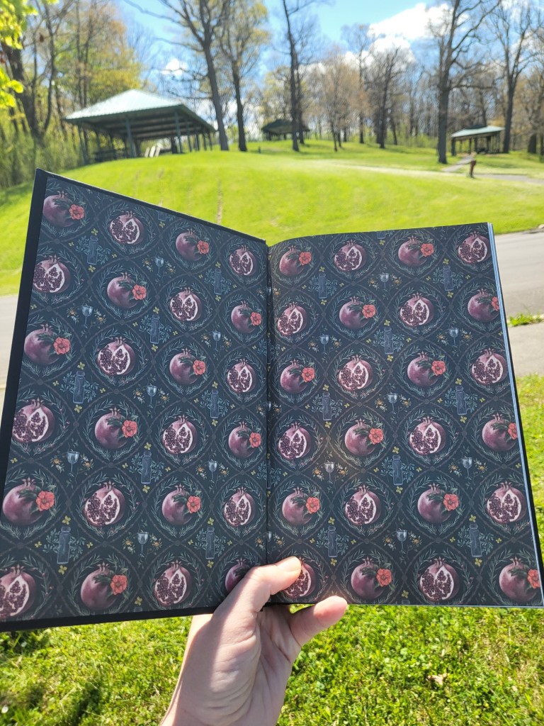
This gorgeous book, The Familiar by Leigh Bardugo (author of Six of Crows and Ninth House, among others) is a 387 page standalone adult historical fantasy novel set in sixteenth century Spain.

The opening line:

If the bread hadn’t burned, this would be a very different story.

When Luzia’s employers discover that their scullion can work small magics, “miracles”, she finds attention drawn to her from all sorts of corners. She fears catching the notice of the Inquisition for multiple reasons, but the flames of her ambition are stoked by the opportunity to compete for a place in the king’s service. Her patron’s familiar, a man made immortal through an ill-gotten bargain, is tasked with teaching her how best to wield and control her powers.

I very much liked the romance in this book, unexpected at it was to the characters involved–but the story was about so much more than that and the magic. It was about class, political machinations, being a Jew in a land that would never trust you, and more. There is one particular side character whose journey and personal growth was quite lovely. 4.5 stars, rounded up!

All that being said, I feel as though some die-hard fans of Bardugo’s YA books, or maybe even Ninth House and Hell Bent, will be disappointed in this one. It is a “quieter” book– there is some showy stuff, but it’s more about the feels and reflection on some serious topics. Which is typically more my jam.

Bookshop

Goodreads

Bookstagram

Opening Lines and Book Cover Battle, April 2024

Of the books I read in the month of April, only The Hunter by Tana French appears to have differing cover designs. Both are fine, but the burning tree image on the UK edition takes the dub this time around.

As for the opening lines of the books I read over the last month, have a gander at these:

Her text came in just before midnight.

The Bad Ones by Melissa Albert

There was a dead girl in my aunt’s bakery.

A Wizard’s Guide to Defensive Baking by T. Kingfisher

Though there’s an industry built on telling you otherwise, there are few real joys to middle age.

Calypso by David Sedaris
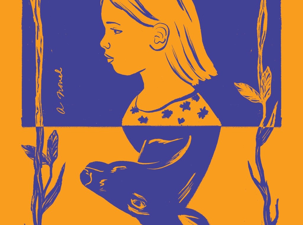
At dusk sixteen-year-old Margaret Murphy sits down at a narrow rickety desk in room 127 at Little Ida’s Motor Lodge, eleven miles east of Niagara Falls, and begins to write her confession.

Poor Deer by Clare Oshetsky

Anna kicked off the annual Pace family vacation with a lie.

Diavola by Jennifer Thorne

Trey comes over the mountain carrying a broken chair.

The Hunter by Tana French

We must, by law, keep a record of the innocents we kill.

Scythe by Neal Shusterman

“We could just push them out of windows,” says Leonie.

Cut & Thirst by Margaret Atwood

The Bad One‘s opening line itself doesn’t do much for this reader, but is followed immediately by what that text message was, which is more of a hook.

A dead person in an unexpected place is always intriguing, but the first line of A Wizard’s Guide to Defensive Baking also lets you know from the get go that the story will be equally dark, cozy, and amusing – an interesting mix!

The David Sedaris memoir likewise begins in a way that advertises the humorous nature of the book.

The opening of Poor Deer is great, setting the scene and immediately having the reader want to know more about what a sixteen year old could possibly be confessing.

Diavola starts right off divulging that it is a story about a vacation involving toxic family dynamics. The supernatural elements get introduced later, with the setting of Villa Taccola.

The first line of The Hunter, in my opinion, is very lackluster. It does nothing for me other than have me say, “Oh, Trey – I remember that character from The Searcher.”

Scythe pulls readers in from the beginning by getting them to wonder why innocents are being killed in a way that requires a record.

The opening line of Cut & Thirst also broadcasts the comical nature of the story, with someone genuinely suggesting defenestration. Now the reader wants to know who might wind up being pushed out of windows, and why.

Overall, this was a pretty good reading month for me. So far I am having success meeting my 2024 goal of reading books that are a better fit for me so that my average star rating at the end of the year will be higher. Even the books here that I didn’t love received no less than 3 stars from me. Not too shabby!
Battle of the Book Covers March 2024 Edition!

Here are the books that I read in March that have differing book covers. Which ones do you prefer?

A decaying horse or human skeleton covered in insect and plant life? I can’t choose, both are perfectly horrifying! I suppose I like the font the the UK cover of What Feasts at Night by T. Kingfisher a bit better, if I had to find something off of which to pick a favorite.

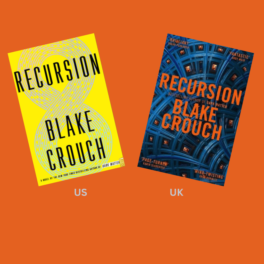
I think both of these covers for Blake Crouch’s Recursion are fine, but I’ll go with the US edition this time, because the UK cover makes me think of a spaceship or some other form of alien technology, which is not what it’s meant to do.

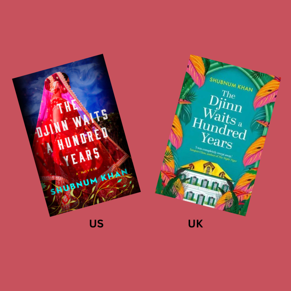
Although the cover image including the manor house might be more fitting, I hands down prefer the US cover of The Djinn Waits a Hundred Years by Shubnum Khan – beautiful color scheme, enticing swirling smoke imagery, mysterious lady in gorgeous apparel, shadowy hands, oh my!

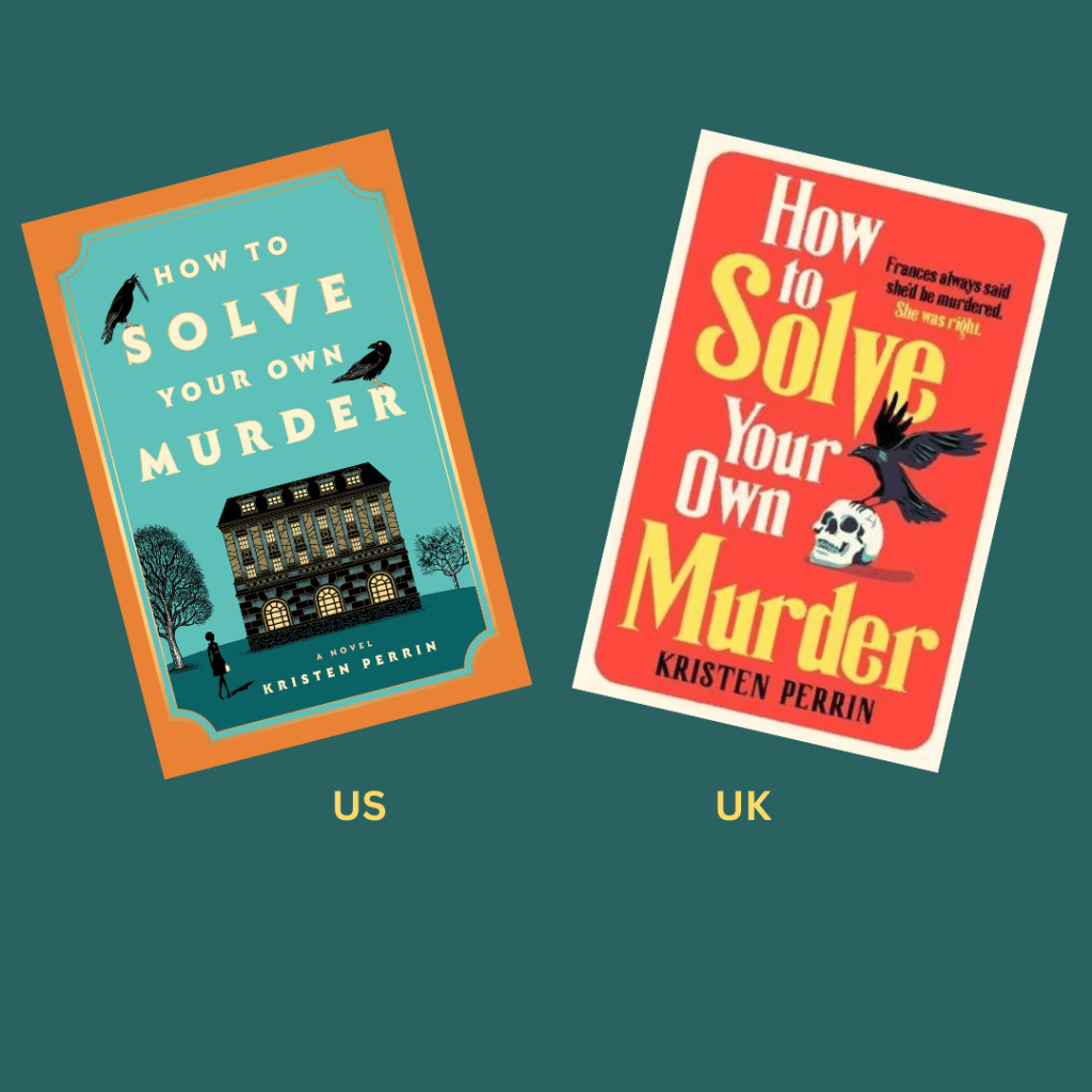
I think the US version of the cover of How to Solve Your Own Murder by Kristen Perrin has a super cute and engaging art style, much more so than the UK version.

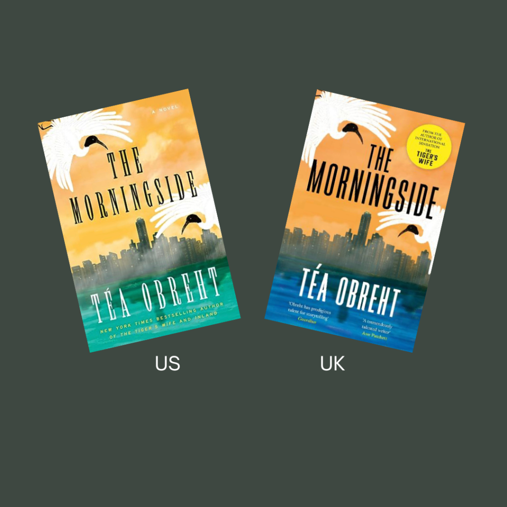
I think the cover design of the US version of Martyr! by Kaveh Akbar is unique and interesting, plus I’m just not a fan of the colors used in the UK edition.

So other than the T. Kingfisher Sworn Soldier novella, which was a close call anyway, I guess this month is a big dub for the US of A. What are your thoughts?